Context
Tien-Min Liao is a graphic
designer is a student who studies the different areas on graphic design like
advertising, typography, animation and self-promotion. This was a self
initiated project so was not made for any particular reason.
Meaning
To help me with the
further understanding of her work I looked at her own website and the other
pieces of work that were shown on her website/blog. I don’t think the work has
a theme apart from the animations being used to show the transformations between
the upper and lower case letters and showing all twenty six letters in the alphabet.
She does however through out the typography project use the same font to create
her words.
Aesthetic
To create this piece Liao
uses only the colour black and paints the piece on her hands to create it. She
is obviously very careful as to where she applies the paint to her hand and has
to think about this first before she applies it so the letters are of a similar
font. She also creates serifs on her letters, which gives it a very formal
look.
Through out her piece the colour
does not change I feel that it would be more interesting if she blended and
changed colours on her hand this way she could give it more tone and would give
it a more three dimensional shape.
Personal Response
I decided to look at
Tien-Min Liao because the typography that we have looked at so far is just
drawing and painting on paper. This way I was able to look at something more
creative and different.
When I first saw this
piece I really liked it, it reminded me of a children’s sock puppet but in this
case it was using letters to teach them the alphabet in a fun creative way.
Liao inspired me to try my
own pieces of hand painted typography but this time using colours. I am only
creating one letter of the alphabet upper and lower case.
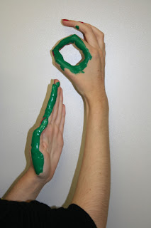
 |
| Lower case ' I ' |
 |
| Upper case `I' |
To create this I had to think about the ways I could paint my hands to create an upper and lower case letter and using only one colour just like Tien-Min Liao. I chose the letter ‘I’ which is probably one of the easiest letters to create but with more time I could have thought about a more difficult letter to create. On Liao’s piece the observer of her work can clearly see that time has been spent on getting the letters absolutely perfect and neat, she also took the time to add serifs to her piece where as mine did not have the extra detail added and so compared to hers the font does not look as formal. It reminds me of a font that children would use, a very friendly one. Just like her I was able to use either both or one of my hands on the upper and lower case so was not limited in this way for creating my letters. I could in fact go on to create the other letters of the alphabet but also improve the way of doing my original piece. In addition to the experimentation I could experiment using different colours, this would give the letter shape and tone.
No comments:
Post a Comment