 |
| Ed Ruscha |
Context
I have chosen to look at Ed Ruscha for the inspiration of my food related typography. At the young age of 26 in 1963 he had his first ever solo exhibition in Ferus Gallery. His background of urban life and having an early career as a graphic designer has influenced him greatly in the techniques of creating his work and the themes of the work. This piece called Ripe was made in 1967 as oil on canvas.
I have chosen to look at Ed Ruscha for the inspiration of my food related typography. At the young age of 26 in 1963 he had his first ever solo exhibition in Ferus Gallery. His background of urban life and having an early career as a graphic designer has influenced him greatly in the techniques of creating his work and the themes of the work. This piece called Ripe was made in 1967 as oil on canvas.
Meaning
To create my further
understanding of this piece of work I have used his website and looked at other
pieces of his work. All of his work uses the same technique of creating the colour
in the background.
The title of the piece is called
Ripe and this word is used on the canvas itself. Before I saw the piece I
thought of bright colours and a fruity tropical feel to it which is exactly
what is given when I saw this piece so does not change my opinion of it.
The piece was made in the late
60’s which was the time of the space launch and was a very colourful time in
fashion and decor. The background does give a hint of this because of the
colour being so faded; if the colours were bright it would change my own views
of when I thought it was made.
Aesthetic
To create this piece the
background has been painted on a canvas using oil colour paints, the two
colours, green and yellow for the background are blended together; they blend
well together because they are next to each other on the colour wheel. The word
Ripe has been dribbled onto the canvas using what looks like pomegranate juice
and seeds. The juice is of a red colour and compliments the yellow and the
green as they are opposite each other on the colour wheel. I think this also
affects the way that the viewer of the work sees it as I think it makes it look
very appetising and tasty, the font used even looks fruity and juicy because of
the wavy outlines of the letters. There is a reason as to why certain techniques
and materials have been used because they are all linked with the theme of
fruit.
Personal Response
I
chose to look at this piece of food typography
because it caught my
eye when I saw it. It just seemed more colourful to all the other pieces that I
looked up. The piece reminds me, quite a lot; of fruit as the colours used are
the colours of fruits like bananas, apples and strawberries.
The
work has inspired me to experiment with a mixture of different types of food
like liquids and solids. It’s also inspired me to use symbols and images with
the words. To
create my pieces of typography we were again put in groups in order to come up
with a few ideas to do with that piece of food whether it was a phrase or a
word.
“Red” is made out of
tomato ketchup. With the word red you would associate it with warnings so this
font does not relate to this as I have used a thin font that is quite swirly
and is not bold. It does however relate to the thought of using Heinz ketchup
because people associate Heinz as a fun brand that is great for children and
the swirly font does therefore relate to this. I tried to add in the letter `d’
the image of a tomato I don’t think that this worked very well.
“Splat” is made out
of alphabetti spaghetti. This phrase goes rather well together I think because
I see this food as something that is messy and should be played around with to
make words.
“Stinky” is again
made out of alphabetti spaghetti. Even though the person viewing this work
cannot smell it, in my opinion it had a rather strong smell to it when you were
sitting next to it.
“Fluffy” is made out
of rice. When you first touch and hear the rice before it is cooked you can see
that it is something that is hard, when cooked it looks very light and fluffy. This
is where this word comes in. I feel that even the way that the rice has been
laid out on the page by not using too much for each letter makes it look fluffy
as well.
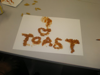
“I love toast” is made out of
beans. I just felt this phrase really related to beans because most people have
beans on toast. Instead of spelling the word love I used the symbol of a heart;
I just thought it would make it look more interesting.
“Crunch” is made out of pasta; I had to crush the uncooked pasta so I could get the broken and cracked effect. I doubt a person wouldn't really envisage pasta
as crunchy, but the way we have made the word crunchy would make the person
think and relate to it.
“Sweet as sugar” was made out of
sugar by creating the word as the negative space. Sweet as sugar came to me as
one of the very first phrases when thinking about sugar as it is so well known.
I think using the background colour pink was a very good idea as I see pink as
a colour that is something that is sweet and good.
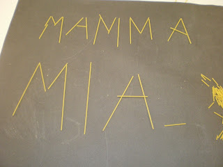
“Mamma Mia” is made out of
uncooked spaghetti. This phrase came to me because when I think of the meal Bolognese
which is made using spaghetti I think of Italy and the phrases that are related
to that country. It was very hard to keep the spaghetti in place as it kept
rolling off the page.
If
I compare my pieces with Ruscha’s work my serious lacks colour, but that is
because he had time to do a more prepared background and so this is what added
to the brightness of his piece, I just had a few choices of coloured sugar
paper. I also feel that the idea of the theme of fruit has been connected more
carefully whereas my pieces are lacking on the thought of the type of font.
Overall
I feel the best piece that I created was fluffy because everything seems to
connect, font, the word used and the way that I have used the material.


No comments:
Post a Comment