Context
Mathilde Nivet is a French
artist who works mainly with paper design. She has graduated as a textile
designer who uses illustration in her work. She creates very detailed cut outs,
in this case she has used typography which is in French it says “he who thinks
little errs much”, and this is a quote said by Leonardo Da Vinci.
Meaning
There isn’t much
information on this artists piece of work so is mostly my own opinion. The link
between the pattern around the outside of the quote that has been cut and the
quote itself does not link; it doesn’t seem to have any type of theme to me.
The quote is basically saying the people who do not think a lot in the first
place will always be pausing for thought, what they want will not come to them
naturally. There is obviously a deep meaning behind the quote.
Aesthetic
To create this piece
the artist has first lightly drawn out the letters and the shapes around the
paper. Then using a very sharp craft knife the design is carefully cut out. For
colour the artist uses a sheet of white and red paper, this is so it makes the
quote readable. The red is a very bright shade; with the design cut out around
the quote it reminds me of mistletoe.
The font used is
simple and bold this makes it easy to cut out, the artist has avoided using
bridges for the center of the letters, this just makes the colour come through
more.
Personal response
I chose to look at
Nivet because she does such detailed cutouts. I really liked her carefully
detailed pieces and the extra designs around the quote. The piece immediately
reminds me of mistletoe. This piece inspired me to create two different types
of paper cutting one being detailed and the other not so detailed. I have also
decided to use two different ways of adding colour.
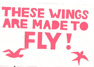
This
is my first paper cut inspired my Nivet. For my piece I used an English quote
from a song that I knew, the song is called `wings’ by Little Mix. I picked
this song lyric because I thought I could create illustrations of birds to add
to my piece to make it look more interesting. Unlike Nivets I have linked the
illustrations with the quote. Similarly I have used the same technique and
materials as to create my piece. I used a pink background because I felt this
fitted in with the nature of the girl band. Another technique that I took from
Nivet was the use of not having the bridges to create the centre of the letter.
I also thought that the font I used matched with their lyric video.


No comments:
Post a Comment