
Context
This illustration has been created by Georgina Luck and
is of the packaging of food and cleaning brands, her work is based on the
drawings of packaging, book jackets and the outdoor media.
Meaning
For the further understanding of her work I have used her
website and looked at her other pieces of work. The themes for her work are
mainly advertising and packaging. I think that these pieces are very
informative when it comes to advertising, as they are very interesting, they
don’t use the normal technique when applying the paint it takes on a very messy
approach. I think these illustrations would be great for children and
encouraging them to eat certain foods as it takes a very fun approach towards
the colour and it is a very bright piece.
Aesthetic
To create this illustration the artist has used
watercolours, inks, fine liner and pencil. The artist has clearly used pencil
first to sketch out the image and has taken the idea of just drawing the contour
lines, rulers are clearly not used and lines are just drawn freely so gives it
a very sketchy feel.
Even though the artist may have not painted so neatly as
other artists would do Luck still gets the idea of the exact colours used on
the piece of packaging. The colours are very bright and for advertising this
does draw the viewers attention.
The splats of paint and the going over of lines when
adding colour gives it a very messy yet fun feel, it goes against the rules of
staying in the lines.
Personal Response
When I first saw this piece of work I really liked it the
messy and quick way of doing these illustrations just really captured my
attention. I chose to look at this piece, as I do need illustrations in my
final magazine piece, but I also looked at it because it showed a fun way of
using advertisement in my magazine, it was different from the norm. I would
also say that I am not that strong on my drawing and so this would be perfect
for me being able to use the quick sketches and the messy approach to
colouring.
This piece has inspired me to create my own contour and
continuous line drawings but to also give myself a short time limit to draw and
colour so the messy effect really comes out of my piece.


Aesthetic
To create this piece the artist has used cut out images from other things like magazines and photos. Seki has then drawn over this creating the architecture; this enables her to add her own twist when she draws them instead of just doing a full collage.


Context
Matthew Midgley is an illustrator who has developed his
skills by working through sketchbooks in his own time. He uses a lot of
observation focusing on urban and everyday life. Midgley feels that he has to
be close to the object he is drawing and this greatly influences the materials
he uses as they have to be portable.
Meaning
To help me with the understanding of his work I have used
his website to look at his other artwork. His work has a theme of observational
drawing to do with the everyday life; clearly as well this is the basis of his
inspiration. Matthew Midgley said on his website that “It's satisfying to see
illustrations which have been produced by hand; there is an authenticity to the
work” I think it does give work more meaning if it is produced by hand and not
using things like Photoshop and illustrator as more time, effort and thought
has gone into it.
Aesthetic
To create theses two pieces Midgley uses pencils, fine
liners and watercolours. In the first image advertising Ikea’s restaurant food,
I don’t think the watercolour goes well with it personally, I don’t think the
quick sketches with the watercolour technique works with making the food look
as delicious as it should. I think the converse looks amazing though. There is
so much detail that has been added to it, this is possibly because of the
cross-hatching of blue lines used to colour the converse. This artist has used
that cross hatching effect to make it look like denim or in other cases could
be the pattern that the cotton makes it also gives texture to the piece. I can
also see slight hints of shading in the shoe to give it that three-dimensional
effect.
Personal response
When I first saw the piece advertising Ikea’s
restaurant food I didn’t like this piece but when I saw the converse it really
changed my opinion of his work. I chose to look at it because he uses simple
sketches and different types of media to colour his work, this piece has
inspired me to try quick time limited contour drawings.

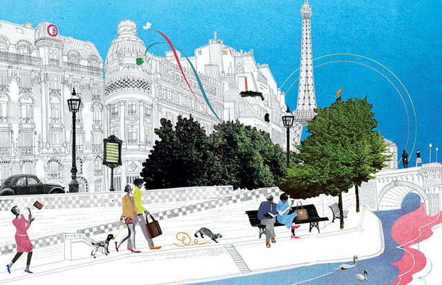
Context
This is a collage created by Natsko Seki using mixed media.
Her work is generally inspired by architecture and fashion, the most important
feature of her work is the use of cut outs from her family photos and uses her
family and friends in her pieces.
Meaning
For my further understanding of Seki’s work I have used have
website and looked at her other pieces of work, also her about section on her
website was also very helpful in the understanding of her work.
I think that Seki’s work has a rather large meaning
especially as she uses family photos to create her pieces it makes her work
rather personal and it makes it special to the viewer of the work because she
is sharing hints of her personal life with us.
The use of the architecture could signify that these are
places that she has been or wants to go; it shows us something that other
artists may not show in their normal use of acrylic painting.
Overall the illustration gives a very happy feel with the
use of bright people and very energetic people used. To add to the quirkiness
of the image the artist has used a ferret running through the illustration.
To create this piece the artist has used cut out images from other things like magazines and photos. Seki has then drawn over this creating the architecture; this enables her to add her own twist when she draws them instead of just doing a full collage.
What surprises me as a viewer of the work is that to me
everything in the picture seems to scale, the fact that the artist has put such
iconic architecture and managed to make everything the right scale in the
picture is to me a great skill.
Seki uses very contrasting techniques, the black and white
line drawings to create the architecture and then colour added to the people’s
clothes, river and the trees, the use of this technique actually makes me see
the drawing of the architecture because there is so much of it, I then see the
trees. The opposing colours, black and white with the blue of the sky and the
three colours used in the river allow the piece to stand out from other
collages. Also colours that you wouldn’t associate with the certain object have
been used and some colours like the blue of the sky have been exaggerated.
Personal response
I chose to look at this piece because I wanted to use a way
I could create an illustration that didn’t just use the normal techniques like
watercolour and acrylic. Plus it was a rather quirky image and allows me to
experiment with different images and place them in places the viewer wouldn’t
normally see.
When I saw the piece I really liked it because of its
quirkiness but also after I read the information it also made the work feel
personal as she used family photos which felt like she was sharing a piece of
her.
This piece of work has inspired me to create my own quirky
illustrated collage, using mixed media like fine liners, images and watercolour
to create my collage.
Comparing artists
Each of these three artists has their own style to create
either an observational drawing or a landscape. Matthew Midgley takes the most
customary approach to creating and colouring his sketches where as Natsko Seki
and Georgina Luck take a more unusual approach.
Luck takes the being messy approach with paint and the
simple but chaotic contour line drawings and makes it look intentional; it
contrasts with the detail that Midgley adds to his pieces.However, Seki does take pride in her architectural drawings as there is so much detail which has been put into it, as the person viewing the work my eyes are drawn more to the trees in the centre so takes the detail away from it slightly.
Natsko Seki uses a lot of mixed media to create her pieces
unlike the other two artists who just use fine line and watercolour. Her pieces
also reach out to me more as she is showing something more personal than just
an observational drawing like the other artists.
I think if I was judging the two artists Midgley and Luck on
advertising I think the best one would be Luck as she makes a normal box of
Kellogg’s look so much more interesting with her unintentional splats of paint.
Each of these artists uses colour but Natsko Seki makes hers
more interesting by adding in black and white images and drawings. It gives the
piece a feeling which takes you back to the times when photos weren’t in colour
it is like they are mixing in the past with the present, this is something that
the other artists have not considered.

This is a drawing of a necklace made using pencil, fine line and ink. to create this piece I drew sketchy circles and lines to make up the necklace, I then added the fine line on top but did not press heavily so the fine line did not catch in some places on the paper. I added droplets of ink on top of this and then lifted the paper up to let it run. This one probably relates more to Luck because of the ink running out of the lines. I feel that this is one of the best drawings that I have created and it will probably be featured a lot throughout my work.

Converse Trainer made using fine line and a blue colouring pencil. I felt that this is one was probably the one that did not turn out the best. to create this I was only allowed to use fine line to draw it I could use pencil also time was short so it had to be a quick drawing, with more time I probably could have made it look a lot better. I decided to draw a converse because I wanted to use the technique of the cross hatching when colouring as this is the technique that Midgley uses.

Books made using fine line and watercolour. Again we were only allowed fine line to get the basis of the drawing, this one was much more simple than the converse as it was just books which are the shapes of rectangles. I then looked at the books and what ever colours stood out to me I added, in this case it was blue and orange. I did add some shading but I could not do much more as again time was limited so had to keep it simple. I think that this image relates to both midley and luck because the drawing of it uses the technique of Midgley yet when you look at the colour it looks very messy and takes on the look of a piece by Luck

Observational drawing of a can of Fanta made using fine line and watercolour. I think this turned out quite well I got the basis of the drawing done and added water colour on top, I also added extra detail on this to actually make it look like a can of Fanta. I think that this piece relates to the artist Georgina Luck because I have just drawn a simple and quick outline.

Continuous line drawings of cacti and shells drawn using fine line. These drawings are made by simply not taking the pen off the paper until you have finished drawing. I was also on a time limit so encouraged me to keep it messy and sketchy. I can obviously relate this to Luck's work as this is what her technique of drawing is about.

leafs drawn using fine line and colouring pencil. For the first one I drew coloured in green is shown slightly incomplete compared to the other one this is because I started off to large and so had to create one on a much smaller scale again these drawings relate more to luck because of the messy drawing technique but the colour takes the technique from Midgley by cross hatching again.

Shells and leafs drawn using fine line. These are probably my most detailed drawings of the natural objects as the time limit was much bigger, they are also a lot neater than my other ones and proves with more time I can make a piece look a lot better. I think that these relate more to Midgley's work.

Book drawn using fine line and watercolour. I think out of the book drawings this one has to be the best for making it look three dimensional as it doesn't look as flat as the other ones, I think this is because I was able to concentrate on just one book and not a collection of them. Again I could only use fine line and then water colour on top of this I added block colour and then splatter paint as this was part of the design on the actual object I think again that this relates to Luck because of its quick sketchy feel and messy approach to applying the water colour.

Jar of Marmite drawn on graph paper using fine line and ink. To create this I had to apply the ink first and then use the fine line to draw around it. This encouraged me to be free when applying the ink I could place it any where I wanted because there was no boundaries. I think this looks more related to a piece by Luck as I have just used simple block colour that stood out on the jar of Marmite.

this is very helpfull
ReplyDelete