To help me with the decision of colours on my final piece I decided to bring all of my documents up at once, this way I could place them next to each other and eliminate the backgrounds one by one. I also used the colour wheel to help me on this so that I could see which colours contrasted and harmonised. In the end I decided on a red background as I thought this would be quite appealing to both sexes and is still a very bright colour. It could also resemble to the idea of velvet and would look quite luxurious but still appeal to teenagers. I then decided on the logo that I would use and it seemed from the three that I chose originally the black would suit this more as the blue would clash with the purple and the orange would clash with the red background. Even though I would like my advert to be bold and bright I do not want a clash of colours as I feel that this would make it look tacky and I do not want my watch to be presented in this way.
These are different processes that I took in Photoshop to edit my piece and change it to make it slightly better.
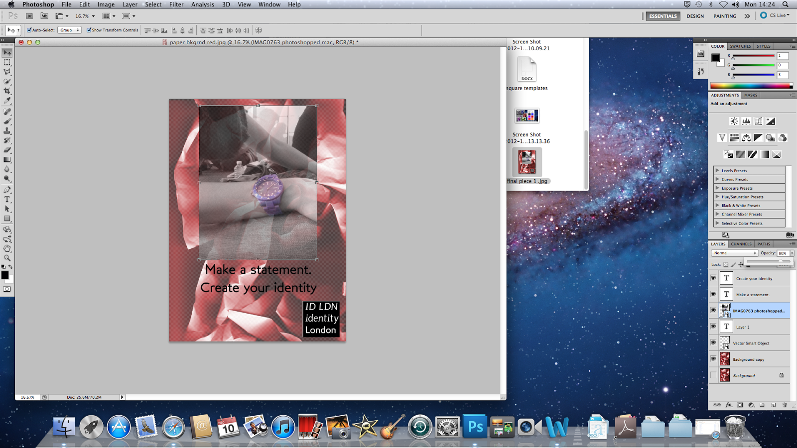
Here I played with the opacity of the image which brought the background through slighty. the background is already bright enough and the image isn't as bold as the background so this would not be such a good idea to use on my final piece.
Just as a little and quick idea I also played around with the opacity of the logo but felt that this was not such a good idea as that is the only bit of the advertisement which states the name of the brand and is small already. I feel that having the name of the brand on the advertisement clearly is a very important feature.
I also played around with the opacity of the photograph and the background together this limited the brightness of it and goes against one of the main themes of my advert.
This is my final piece showing a smaller image and felt that I needed to make the image bigger as usually in an advert the image is what takes up most of the advert not the background or the typography.
This is what my advertisement looks like after I made the image bigger.


No comments:
Post a Comment