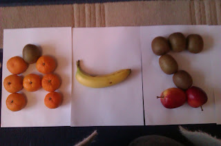
This is a collection of fruit typography that I made for the title of my feature spread I tried to delete the background but it took out bits of the fruit when I got rid of the background. Using this idea to make the title is very creative and shows the fruit in a natural light but as it takes pieces of the fruit away I am not going to use this as the title for my final article.
This is a collage I made but cutting up magazines to get different colours to add to my letters that I hand drew. I think the ripped effect on the pieces of paper on the inside of the letters makes it look very natural and fun. I have now decided that I am to use this as the technique of creating the title for my feature spread.


No comments:
Post a Comment